Technical lead by day, compulsive tinkerer by night. I take the gnarly, real parts of building software and turn them into talks people actually quote afterward.
Software development is fundamentally an exercise in composition. We take big, complex problems and organize them into smaller, solvable parts. So the question isn’t whether you’re composing or not. It’s whether you’re composing with intention.
We aren’t here to rehash “composition vs inheritance” or preach about the dogmatic use of the latest architectural trend. This is the full-length edition of the talk: forty minutes with room for the examples, detours, and hard-won scar tissue the short version can’t fit.
This talk equips you with the skills to manage your cognitive budget even when you’re facing developer fatigue, mounting technical debt, or AI-generated bloat.
Catch it live at Web Unleashed, October 27–28 in Toronto. Two days of frontend talks, in person or streamed online.
React made composition the default way we build. But composing constantly isn’t the same as composing with intention.
We aren’t here to rehash “composition vs inheritance” or argue about folder structures. This is the distilled edition of the talk: twenty minutes on the thought process behind structuring code so you spend less time writing, less time reading, and less time debugging.
In this presentation, we will cover a practical three-step process for designing readable and low-friction systems:
Split responsibilities to reduce complexity.
Strengthen interfaces for wide applicability.
Connect components to improve maintainability.
This talk equips you with the skills to manage your cognitive budget even when you’re facing developer fatigue, mounting technical debt, or AI-generated bloat.
Let’s stop being afraid of our own codebases.
This one streams live on November 20; grab a remote ticket and watch from anywhere.
Do you know that one feature no developer wants to touch?
The one that somehow takes forever to update and seems responsible for 80% of the application. The component with dozens of props, flaky tests, and a mysterious workaround nobody fully understands anymore.
Systems like that become difficult to maintain. They slow development, erode confidence, and make even small changes feel risky.
Let’s stop being afraid of our own codebases.
Key take-aways
Reading code is harder than writing code. Code should be organized into pieces with a narrow responsibility, wide applicability, and low cognitive overhead. Don’t DRY things that look the same, DRY things that are logically the same. Think of code as a noise to signal ratio, make it easy to find what’s important. AI amplifies the issues of poorly composed code. All code has cognitive cost, spend your budget wisely.
This webinar grew into Better Living Through Composition, now on tour: the full 40-minute version at Web Unleashed Toronto on October 27, and the 20-minute cut at React Summit New York on November 20.
I’m not going to make very many friends with this one, but I’m a huge supporter of RTO. In this conversation I get into the real, human cost I watched remote work inflict on developers of all tenures and why I think most teams are quietly drowning in process they’ll never claw back, and how AI is helping all of us write wrong code faster than ever.
Key take-aways
In a service-based company, the office brought people together when the work didn’t. Like a chain reaction, a culture of learning requires a critical mass to become self-sustaining. Just like stage makeup, you have to exaggerate to be noticed at a distance. Process has a tendency to creep in like water and set like concrete. A strong team is going to know the price on how they work, and decide to pay it because it will be worth it.
We all know that feeling… That moment when the grind sneaks up on you, quietly building until it takes over. And don’t pretend you haven’t been there. We’re all friends in the land of the grind. Let’s revisit some shared scar tissue with a quick scenario:
It’s the beginning of a brand new project. The codebase is empty and full of promise. Full of potential. It’s your job to take the beautiful design specs and transform them into a fully functional web application. The design team has given you visual mock-ups but not much else. You get started by extracting colour variables and assembling them into a nice, symmetrical colour palette. You make some assumptions around how these colours relate to each other, mostly aligning them based on hue, but you feel good about where you are.
But an undefined amount of time later, a new feature comes in, and it introduces some new colours. Now the panic sets in. You can feel your palms getting sweaty. And you do what every developer who’s not good at naming things does:
You try your best. It stings at first, but you get used to it. You’ve accepted your fate, you’ve moved on, and – dare you say – you’ve grown a bit as a developer.
But eventually an unnamed CEO comes in and demands a brand refresh. Instead of the teal, they say, the accent colour must now be pink. You wince, for you know your fate, but you tempt the devil, anyway.
But this will bring shame onto your family. Your children will cry. Your friends won’t invite you to their birthday parties. No, you’re an honourable dev. And you know what must be done.
You must update your variable names. And then you must comb through the code to update all of your old references. All one million of them. The diff alone will make your eyes water. But you do it because you know it must be done.
What we just experienced is colloquially referred to as “the grind”. It’s a cycle of needlessly difficult and monotonous tasks that drain us of our creativity and prevent us from focusing on the interesting technical challenges. And UI development is often fraught with it.
But what if I told you it doesn’t have to be this way? What if I told you it doesn’t have to be difficult? So let’s peek behind the mask, shall we? What is at the root of “the grind”?
The core issue behind grind, from variable naming nightmares to inconsistent component design, is assumptions. In either the effort it takes to make them, or in the even greater effort it takes to break them.
We made assumptions when we created our colour palette, we invariably got it wrong, and then we had to spend extra time undoing it.
So by avoiding assumptions, we should also be able to avoid the grid. Assumptions are born of a lack of information, particularly during the design/development handoff. How do we ensure we have enough high-quality information to avoid making assumptions and, consequently, the grind?
Introducing design tokens
Design tokens are basically just variables. They hold a single, primitive value like a colour, a dimension, a font family, a font weight, etc. But even better than variables, they’re defined by the design team. These tokens define the patterns and rules that drive all UI mocks, meaning designers will rely exclusively on these tokens. To rely on anything else would be to break the underlying fabric of the entire design. So, instead of developers trying to retroactively infer meaning and cobble together a somewhat sensible variable system, the design team hands us these tokens before we even begin:
Now, it could be tempting to forget ourselves in the excitement and start referencing these values throughout our UI. But that would be a mistake. To rely on these values is to rely on the assumption that they will never change. And that’s a dangerous place to be.
If the design team changes this card’s background, a developer will still need to go and manually make that change. In fact, any little tweak that the design team makes will need to be manually implemented by a developer. Those little adjustments add up to a big ol’ grind, and that’s exactly the life we’re looking to escape. A concept called “token layers” will help shield us by abstracting away the constant need for manual tweaks.
Introducing token layers
Another way tokens are like variables: they can reference other variables.
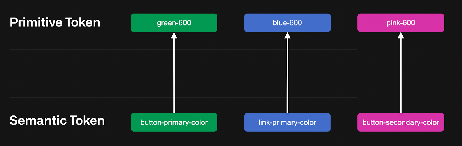
The layer we just received is called a “primitive” layer. It holds exact values without any extra meaning; just raw, concrete values. While these values are stable and unlikely to change, the way they are used throughout the design will. To help insulate the UI from this volatility, we can introduce a new “semantic” token layer.
The semantic layer is a basic abstraction. While semantic token values may change frequently, where they are used will not. By relying on this semantic layer, our card component is protected from frequent changes. Our component now looks like this:
The design team can change the value of “card-background” as much as they want. Nothing in our code needs to change. Frequent design tweaks that usually require development grind are now abstracted away from our display logic. That’s a beautiful thing.
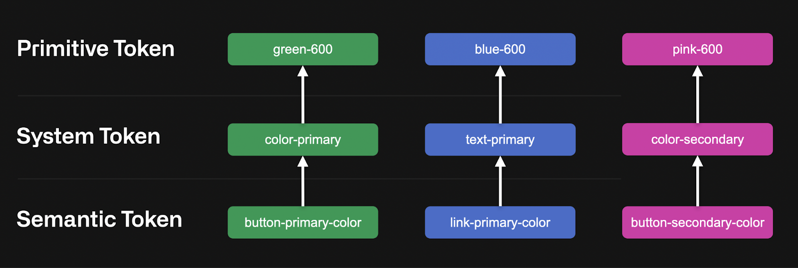
However, it’s also very common to have a third “system” layer in between primitives and semantics. I’ve tinkered in Figma long enough to know how grindy it can be to make widespread updates, and this extra layer gives the design team a tool to avoid at least part of it. The system layer allows us to organize tokens into functional roles. Think of your “primary” and “accent” colours, your “small radius” dimension, and your “large padding” size. These system tokens, for example, make it much easier to support light/dark modes, which requires replacing a huge swath of functionally-similar tokens (backgrounds, contrast colours, etc).
You can have as many or as few token layers as your project warrants, but I would always recommend supporting the “primitive” and “semantic” layers. Don’t be dogmatic about the rest. Use what you need and leave what you don’t.
Design tokens as a shared contract
These tokens transform the relationship between design and development from a simple handoff of static assets into an ongoing, dynamic collaboration. They serve as the official touchpoint between the two teams and replace guesswork with a formal agreement:
The design team promises to build the entire UI exclusively on top of these tokens
The development team promises to consume and support them throughout code
It’s so beautiful I want to cry.
Using design tokens
But it gets even better. These tokens can be expressed through a JSON export.
And on and on it goes for about 10k lines. With lots of unresolved references. All nestled within a super nested hierarchy.
But hear me out. This export is a data-driven representation of our token layers, of our shared contract with the design team. This means that any changes from the design team can be represented as a new token export. And isn’t that something worth fighting for?
Introducing style dictionary
Style dictionary is a build system that focuses on supporting design systems. It takes that headache-riddled JSON export and allows you to transform it into literally anything you want.
You get the picture. The system is completely modular so you can plug in any transformations you want. Sure, building the initial configuration can be a bit, well, grindy. But when you compare it to the constant styling and restyling of multiple components throughout an app’s lifetime, well, it’s really a walk in the park.
In closing
I first worked with design tokens and style dictionary as a technical lead on a multi-platform editorial product. And I’ve never looked back.
The design team maintained a single token export that was ingested by all three platform teams (Android, iOS, and web). Each platform had its own style dictionary configuration that would transform the tokens into their bespoke format (on the web, we generated an entire MUI theme), and updates were quickly available for product and design verification. Everything everywhere always looked like the same editorial.
Benefits:
Changes to these token values will never need developer involvement.
If something in the UI changes that can’t be supported by the token layer, it’s understood that it will require development effort.
Design and development timelines can support more overlap, avoiding waterfall-style handoff and condensing timelines.
Removing the middle-man (developer) removes a potential point of failure, meaning the UI will more closely match what the design team has mocked.
Design adjustments can become a part of the CI/CD pipeline.
A single source of truth ensures design parity across all platforms.
In short, this job can be a whole lot of fun, but it can easily become overrun with grind if you let it.
Bridging the gap between design and code shouldn’t be hard. In this talk, let’s explore what design systems are, why they matter, and how developers can use them to power automated workflows that deliver consistent, production-ready UI. You’ll learn how to ingest and transform design tokens with Style Dictionary and apply them across modern styling systems like MUI and Tailwind.
This talk will also cover practical component design patterns that help keep your system scalable and maintainable. Whether you’re already working with a design system or just getting started, this session will give you practical tools to automate more and ship faster.
The talks come from real work — the salaried kind and the can't-help-myself kind.
9 to 5
Staff Developer, REDspace
At REDspace I am the queen of code review. No PR is safe from my obsessive pursuit for beautiful code. It is easily my best and worst quality, but my team has learned to love me for it.
Technical Writing Project Estimation and Planning Task Definition and Delegation Mentorship
5 to 9
Founder, ThirdPixel Software
I founded ThirdPixel to bring a personal touch back to tech. All decisions are mine, as are their resulting success or failure.
Artisan, hand-crafted code Enterprise knowedge, scaled down for non profits Keeping tech in the hands of business owners
The name ThirdPixel is derivitave of a harmonic device. Whoever guesses it correctly is a huge nerd.
Let's talk
Have a stage that needs filling?
Tell me about your event. I reply to every real message, usually within a day or two.